Do you work with different series in your Excel charts?
Here is what I would like the final chart to loo like. Note the white dashed lines in front of the columns:

Setup:
I started with the chart I ended with in my last post, Points Of Interest.
I then added some data to a separate worksheet in my workbook to replicate the horizontal gridlines.

Note in Col A that I used the exact same scale that I used for Series 1 which is what was used to plot the column charts (Really 1 chart)
Also note that I put data that is used for formatting on a separate worksheet from "Value Data". This makes it easier to maintain data as it needs to updated overtime

1. Horizontal gridlines
I am going to add fake horizontal gridlines to the chart, so first I'l remove the current horizontal gridlines.- Click on the chart (This will activate the Chart Tools Group on the Ribbon)
- Click on "Layout" in the chart tools group
- Click on gridlines
- Click on Primary Horizontal Gridlines
- Click on "None"

2. Add "Fake" horizontal gridlines
I copied all data from the formatting tab including the horizontal axis column, clicked on my chart and pasted the new series. I could click on each of the new series on the chart and change the chart type from column to line and apply all of the formatting. But I would like to do it with VBA. So I'll step through each part of the process separately
3. Change the chart type:
First I need to chage the chart type for each series that is not a value series which was series 1. So I'll loop through the SeriesCollection starting at number 21: Option Explicit
2: Sub SetChartType()
3: Dim wb As Workbook
4: Dim ws As Worksheet
5: Dim i As Integer
6: Set wb = ThisWorkbook
7: Set ws = wb.Worksheets("Sheet1")
8: With ws
9: .ChartObjects(1).Activate
10: For i = 2 To .ChartObjects(1).Chart.SeriesCollection.Count
11: .ChartObjects(1).Chart.SeriesCollection(i).ChartType = xlLine
12: Next i
13: End With
14: 'Tidy up
15: Set ws = Nothing
16: Set wb = Nothing
17: End Sub

4. Format the color of the lines
I would like each of the horizontal lines to be white1: Option Explicit
2: Sub SetChartColor()
3: Dim wb As Workbook
4: Dim ws As Worksheet
5: Dim i As Integer
6: Dim lWhite As Long
7: Set wb = ThisWorkbook
8: Set ws = wb.Worksheets("Sheet1")
9: lWhite = RGB(255, 255, 255)
10: With ws
11: .ChartObjects("Chart 1").Activate
12: With ActiveChart
13: For i = 2 To .SeriesCollection.Count
14: .SeriesCollection(i).Select
15: With Selection
16: .Format.Line.ForeColor.RGB = lWhite
17: End With
18: Next i
19: End With
20: End With
21: 'Tidy up
22: Set ws = Nothing
23: Set wb = Nothing
24: End Sub
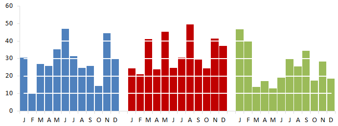
5. Change the line type:
The chart is looking pretty good. But the lines are a little thick, I would like something more subdued. I played around a bit with different line weights and dash styles until I found values that I liked1: Option Explicit
2: Sub SetLineProperties()
3: Dim wb As Workbook
4: Dim ws As Worksheet
5: Dim i As Integer
6: Dim lWhite As Long
7: Set wb = ThisWorkbook
8: Set ws = wb.Worksheets("Chart")
9: lWhite = RGB(255, 255, 255)
10: With ws
11: .ChartObjects("Chart 1").Activate
12: With ActiveChart
13: For i = 2 To .SeriesCollection.Count
14: .SeriesCollection(i).Select
15: With Selection
16: .Format.Line.Weight = 1.5
17: .Format.Line.DashStyle = msoLineRoundDot
18: End With
19: Next i
20: End With
21: End With
22: 'Tidy up
23: Set ws = Nothing
24: Set wb = Nothing
25: End Sub
I added the major horizontal gridlines back to the chart and made them very thin and light grey
The final chart:
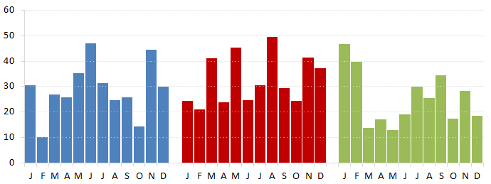
The lines may be a little thin for your tastes, just adjust the line weight until you get the effect you are trying to achieve.
I hope you enjoy the post and that you find something of value in it.
Additional resources:
How do you use the SeriesCollection in your VBA or work with series in your charts? Let us know in the comments below.




