A reader on one of the LinkedIn Excel Groups recently asked how to delete cell styles from a workbook. Today, I'll show a possible solution.

I then ran this code:
This returned 47 different styles. I am not going to list them all here. They are included in the workbook that you may download at the end of the post. Your workbook may have more or less depending on any customizations you have already made to your workbook or if you are working on a workbook you received from someone else.
Once you have a list of the styles, you may edit the list for thes styles you wish to keep or leave them all on the list if you wish to delete them all.
Let's see what happens if we delete all of them, shall we? This will only impact Cell Styles. It will not impact Table Styles or Chart Styles.


Deleted 46 out of 47. Apparently cannot delete all styles or at least the "Normal" style.
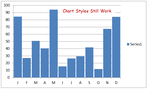
Chart styles still work

You may now add any custom styles to your workbook. But please, no Gangnam Style :-)
(Sorry Psi)
More on Styles and VBA from Jan Karlel Pieterse
Download the Cell Styles workbook here
How do you work with Cell Styles and VBA? Let us know in the comments section.

The Cell Styles Group:
List Cell Styles:
I opened a workbook, Alt+F11 for the Visual Basic Editor and cooked up the code below. I then opened another workbook and made sure the first sheet was active by clicking on cell $A$1.I then ran this code:
1:  Option Explicit
2:  Sub ListStyles()
3:    'List all styles in a workbook

4:    Dim C As Range
5:    Dim rng As Range
6:    Dim i As Long
7:    Dim lRows As Long

8:    With Application
9:      .ScreenUpdating = False
10:      .EnableEvents = False
11:    End With

12:    With ActiveWorkbook
13:      'Add a temporary sheet
14:       .Sheets.Add before:=Sheets(1)
15:      'List all the styles
16:       For i = 1 To .Styles.Count
17:        ActiveSheet.Cells(Rows.Count, 1).End(xlUp).Offset(1, 0) = _
18:          .Styles(i).Name
19:      Next i
20:    End With

21:    'Tidy up
22:     'Destroy objects
23:     Set rng = Nothing
24:     Set C = Nothing
25:     'Excel environment
26:     With Application
27:      .DisplayAlerts = True
28:      .EnableEvents = True
29:     End With
30:  End Sub
This returned 47 different styles. I am not going to list them all here. They are included in the workbook that you may download at the end of the post. Your workbook may have more or less depending on any customizations you have already made to your workbook or if you are working on a workbook you received from someone else.
Once you have a list of the styles, you may edit the list for thes styles you wish to keep or leave them all on the list if you wish to delete them all.
Let's see what happens if we delete all of them, shall we? This will only impact Cell Styles. It will not impact Table Styles or Chart Styles.
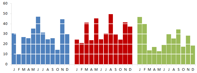
Styles Group Before Delete:
Delete Cell Styles:
Here's the code I am going to use to delete all cell styles from the cell styles group.1: Option Explicit
2: Sub ClearStyles()
3: 'Deletes all styles from the active workbook
4: Dim lRows As Long
5: Dim C As Range
6: Dim rng As Range
7: With Application
8: .ScreenUpdating = False
9: .EnableEvents = False
10: .DisplayAlerts = False
11: End With
12: 'Make sure to click on sheet with list of styles to be deleted
13: 'Assumes list begins in $A$1
14: With ActiveSheet
15: lRows = .Cells(Rows.Count, 1).End(xlUp).Row
16: Set rng = Range(.Cells(1, 1), Cells(lRows, 1))
17: End With
18: With ActiveWorkbook
19: For Each C In rng
20: On Error Resume Next
21: .Styles(C.Text).Delete
22: .Styles(C.NumberFormat).Delete
23: Next C
24: End With
25: 'Tidy up
26: 'Destroy objects
27: Set rng = Nothing
28: Set C = Nothing
29: 'Excel environment
30: With Application
31: .ScreenUpdating = True
32: .DisplayAlerts = True
33: .EnableEvents = True
34: End With
35: End Sub
Bam!!
Deleted 46 out of 47. Apparently cannot delete all styles or at least the "Normal" style.
Chart styles still work
Excel Table styles still work
You may now add any custom styles to your workbook. But please, no Gangnam Style :-)
(Sorry Psi)
More on Styles and VBA from Jan Karlel Pieterse
Download the Cell Styles workbook here
How do you work with Cell Styles and VBA? Let us know in the comments section.